This rad app called Hangar 360 captures a spherical photo from 300 feet in the air. If you look at them on your phone the picture takes advantage of your phone’s sensors and the image moves as your phone moves.
Click on the linked location to view the spherical photo.
Wolf Point – this launch site can no longer be used because it became an active construction site for the second of three skyscrapers a couple of days ago.
Garfield Park – one of the city’s grand parks and part of the boulevard system, or “Emerald Necklace” that connects the Northwest Side boulevards to the West Side parks of Humboldt Park and Garfield Park to the South Side parks of Douglas Park, Washington Park, and Jackson Park.
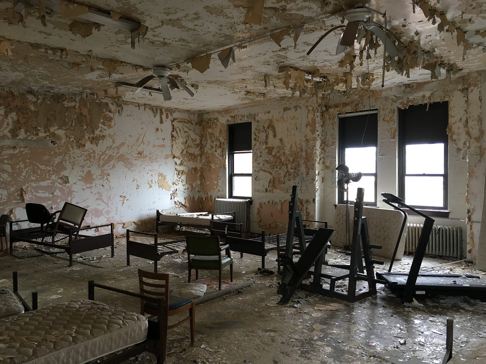
West Side incinerator – these two smokestacks remain from one of the city’s four trash incinerators, and are the subject of an upcoming story from City Bureau.
The vacant lots on the 2300 block of W Erie Street are owned by the City of Chicago.
At many public meetings about development proposals, people oppose new housing on their block because it “doesn’t fit in with the character of the neighborhood”.
This is often a code or mask that the person is trying to prevent anything from changing on their block (a.k.a. NIMBY), and sometimes trying to prevent a certain kind of person (poor, Black, disabled, veteran, you name it) from living near them.
Chicago is selling six vacant lots (marked as one parcel & PIN) to a developer for $6 who will buy six single-family houses that will cost about $247,000. Only a person or family who earns up to 120 percent of the area median income could apply to purchase the house; they have to live in it for 15 years.
The other dominant building type on the block are these one-story single-family houses.
I personally think that two-flats should be built here, because land is expensive and scarce, and there should be more affordable housing everywhere in Chicago.
Are there objective ways to measure the character of a block or neighborhood? Sometimes when people say character they mean that the proposed buildings are too tall, relative to existing buildings. Other times they mean that theirs is a single-family neighborhood and thus anything with more than one unit per lot is “out of character”.
One of the common building types on the block are these masonry single-family houses.
I can measure that. I’ve started developing a query against the Cook County property tax database that Chicago Cityscape has which will count the different property types on any given block.
One of the six lots is 2327 W Erie St (it’s currently classified as “UnClassified”). Here’s a breakdown of the other property types on the block:
Residential garage (1 of these)
Apartment building with 2 to 6 units, any age (5 of these)
One Story Residence, any age, 1,000 to 1,800 square feet (10 of these)
Two or more story residence, up to 62 years of age, 2,001 to 3,800 square feet (8 of these)
The dominant building type is a single-family house smaller than 1,800 square feet. The proposed houses will have 2,500 square feet and two stories, which is similar to the characteristics of the second most present building type on the 2300 block of W Erie St.
I’ll be rolling out this feature within a couple of weeks on Chicago Cityscape after some more testing. (Right now it can only grab the properties in the red boundary on the above map, and not the corner properties that have addresses on the intersecting streets, because the query uses string matching to find addresses on “W ERIE ST” with building numbers between and including 2300 and 2399.)
This was the third attempt to sell the property, and the Chicago Plan Commission will review the sale at its June 15th meeting.
Photos of the fire house taken during the February 2017 open house by Justin Haugens.
The two created a website dedicated to their proposal, and published a video introducing Scott Whelan, a developer who will be helping renovate the building. Whelan’s company, Red Line Property Group, pulls building permits mostly in the Edgewater and Lincoln Square community areas.
The image on the top-left shows the original bay doors. Renderings from the buyers’ website.
Andrews and Vance will locate their existing businesses to the building, restore the façade and historic features, add a garden and greenhouse to the rooftop, and provide on-site parking for up to 10 cars. Sustainable design features include photovoltaic solar panels on the roof, passive solar hot water, and geothermal heating and cooling.
Andrew Huff pointed out some archaic neighborhood names he saw on a map that was generated using Carto. The company’s map “tiles” use free and open source data from OpenStreetMap, “the Wikipedia of maps”.
I’m going to tell you where these names come from!
I had a similar question as Andrew several years ago. (Note: I’m a very active OpenStreetMap editor, and I add/change/delete things from the map multiple times a week.)
First, we have to find that place name in the OpenStreetMap database, after which we can discover its provenance. The best way to do this is to search Nominatim, the “debugging search engine” for OSM.
That details page still doesn’t tell us what we need to know, but there’s a link called that starts with “node” that leads deeper into the OSM database.
On the page “Node: Summerdale (153430485)” there are a bunch of “tags” that describe this place’s record in the OSM database. Some of those tags start with “gnis”, which is an abbreviation for “GeoNames Information System”, commonly shortened to GeoNames.
GNIS is managed by the U.S. Board of Geographic Names, which is part of the United States Department of Interior’s U.S. Geological Survey (commonly known as USGS).
We can use the GNIS Feature Search site to look up Summerdale by name or ID. (Using name is easier, and I recommend narrowing it to the state of Illinois.)
There are four results for “Summerdale” in Illinois, and two are in Cook County, and one of these is a church, and the other a “populated place”. We want the populated place result.
Here’s where our journey ends, because this result page tells the citation of how “Summerdale” got to be in a United States federal government database of place names.
Hauser, Philip M. and Evelyn M. Kitigawa, editors. Local Community Fact Book for Chicago 1950. Chicago, Illinois : University of Chicago, 1953. p18
Finding the original source
You can find that book in the Newberry library in Chicago. Request it on their computer and a librarian will fetch and bring it to you. I did that in 2015 (which was also the first time I visited the library).
Here’s what that book looks like, and you can see “Summerdale” mentioned at the end of the third paragraph on the page for the Uptown community area (which is an official place with a permanent boundary):
During the 1870’s and 1880’s, Uptown was still predominantly open country. The area east of Clark Street, from Montrose to devon, was a farming community. At each of the station that had been opened on the Chicago and Milwaukee line –at Argyle, Berwyn, Bryn Mawr and Devon Avenues–there were a few frame residences. West of Clark Street, a substantial portion of the land was swampy. Scattered settlements, chiefly the frame cottages of railroad employees, appeared along the Northwestern railroad tracks. An important factor in the growth of this area was the opening of the Ravenswood station at Wilson Avenue. The opening of another station on this line at Foster Avenue, eventually gave his to the settlement of Summerdale.
I haven’t answered Andrew’s other question, on why Lincoln Square or Uptown, official community areas with permanent boundaries, don’t show on Carto’s map.
That’s because no one has imported these boundaries or these place names into OpenStreetMap. You can do it, and here’s how.
I redesigned the static maps that are shown on Chicago Cityscape’s Place pages to tone down their harsh hues, and change what data (which comes from OpenStreetMap) is shown.
All 2,800 maps are automatically generated using a program called MOATP (“Map of all the places”) which is based on Neil Freeman’s svgis program. Both programs are open source.
The map now shows all roads; it was awkward to see so many empty spaces between buildings. Secondary* and residential roads are shown with slightly less thickness than primary and motorway roads. Also included are multi-use trails in parks.
Parks and grass are shown in different hues of green, although I don’t think it’s distinctive enough to know there’s a difference. Cemeteries remain a darker green.
I’ve changed the building color to soften the harsh brown. Only named buildings and schools appear, which is why you see a lot of gaps. Most buildings outside downtown aren’t named.
Retail areas have been added in a soft, salmon and tan-like color to show where “activity” areas in each Place.


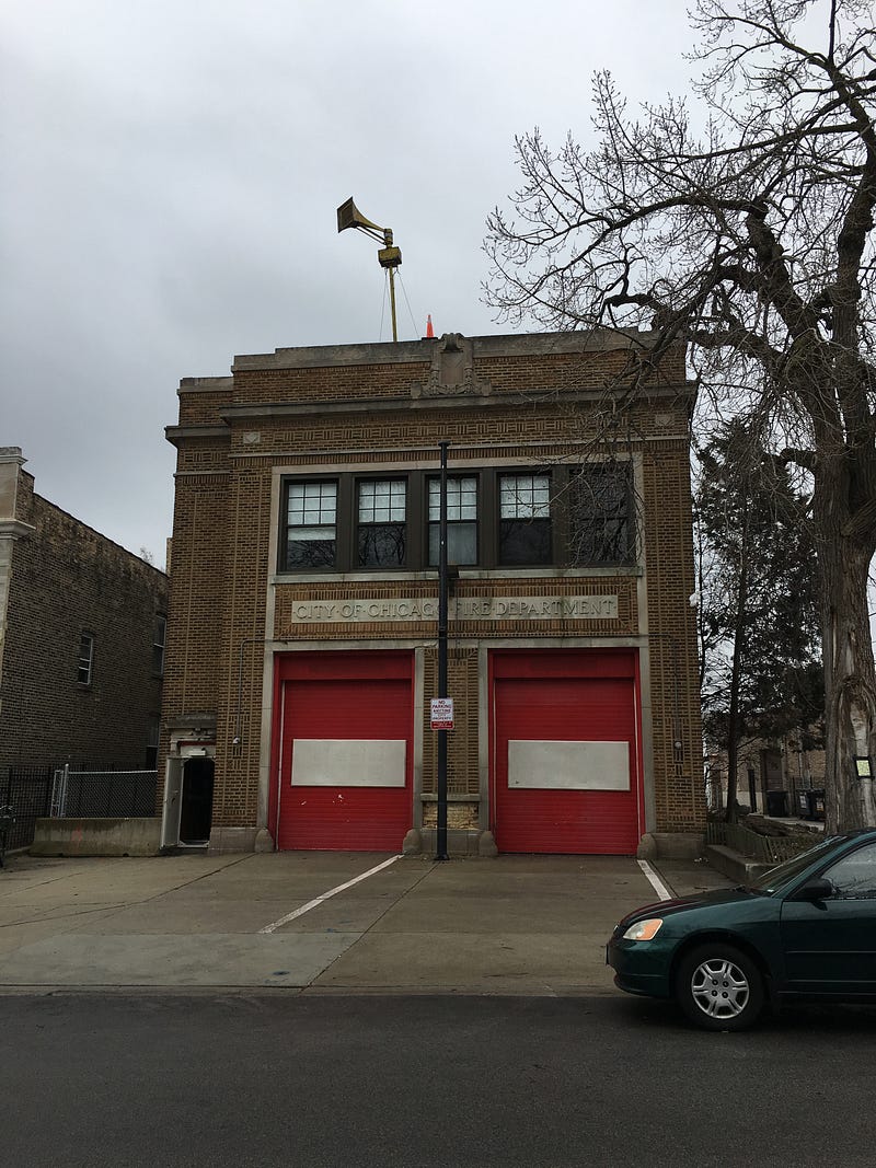 The city-owned fire station at